Share
Introduction
We live in the mobile era, where smartphones and tablets have become the primary tools for accessing the internet. From Google searches to online shopping, consumer behavior has changed, and companies need to keep up with this transformation. In this scenario, responsive design is no longer a differentiator – it is a basic necessity to ensure a consistent and effective experience across all platforms.
What is Responsive Design?
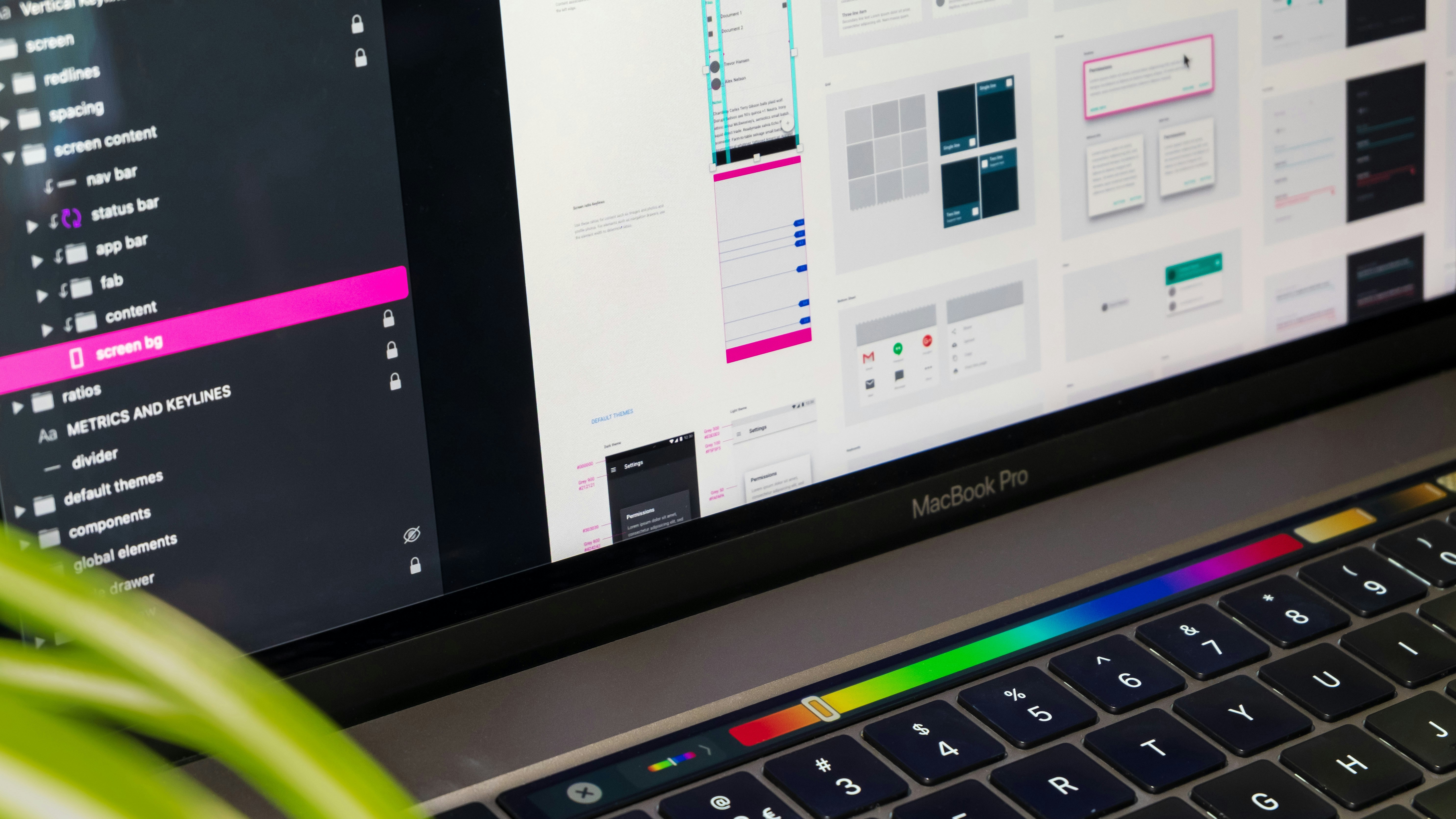
Responsive design is an approach that allows websites and applications to automatically adjust to different screen sizes and devices. Whether on a smartphone, tablet, or desktop, the content reorganizes and resizes to provide the best user experience.
Main characteristics of responsive design:
Flexible layouts that adapt to the screen size.
Adjustable images and videos to avoid cropping or distortion.
Interactive elements optimized for touch on smaller screens.
Benefits of Responsive Design
Better User Experience
Nothing is more frustrating for a visitor than navigating a website that does not adapt to the device they are using. Responsive design offers:
Intuitive navigation on any screen.
Accessible buttons and links, avoiding accidental clicks.
Fast loading, essential to retain users on mobile devices.
Impact on SEO
Search engines, like Google, prioritize responsive sites in search results. A responsive site not only improves search rankings but also reduces bounce rates, as users spend more time navigating a functional site.
Increase in Conversion Rates
A responsive layout facilitates actions like filling out forms, making purchases, or clicking on call-to-action links. When the experience is enjoyable, users are more likely to make conversions, which directly impacts financial results.
Reduction in Development Costs
Maintaining a single responsive site is more economical than creating separate versions for desktop and mobile. Additionally, updates can be made centrally, saving time and resources.
The Risks of Not Investing in Responsive Design
Companies that ignore the importance of responsive design face challenges such as:
Loss of visitors: Users quickly abandon sites that do not offer a good mobile experience.
Drop in Google ranking: Non-responsive sites are penalized in search results.
Impact on brand reputation: A poorly optimized site can convey an image of neglect and lack of professionalism.
Success Examples
Major brands that implemented responsive design have seen significant results. For example:
An e-commerce site that improved its conversion rate by 50% after making its site responsive.
A media company that reduced its bounce rate by 30% by redesigning its site for mobile devices.
At Designtinic, we help companies create responsive solutions that combine aesthetics and functionality, providing real results.